See what is already there.
A home can carry craft, memory, and a close connection to its street. We show that character without hiding its condition.
 Helping foreigners buy property in Japan
AkiyaHub brand
AkiyaHub brings people closer to homes across Japan with a brand shaped by care, place, and the possibility of a new life.
Download logos
Old does not mean finished.
AkiyaHub exists because an empty house can still hold a future. Our identity keeps that belief close.
The mark brings together a home, Mount Fuji, and a rising sun. Paper, ink, and texture give it a sense of place without turning Japan into decoration.
What guides the work
The brand should help people look more closely. It should make room for the beauty of a place and the facts that shape a decision.
A home can carry craft, memory, and a close connection to its street. We show that character without hiding its condition.
Buying in another country can feel distant and complex. Our design makes the people, choices, and next steps easier to understand.
A home is a serious decision. Quiet layouts, useful words, and honest images give people space to consider it well.

The roundel carries the central idea of AkiyaHub in one compact form. Each part has a job, and each part stays together.
The black form holds both a house and Mount Fuji. It connects the idea of home with a clear sense of place.
The red circle can read as a rising sun or a Japanese seal. It gives the mark warmth and recognition.
The white keyline protects every part of the artwork on dark, light, and photographic backgrounds. It is part of the logo.
The wordmark is bold and easy to recognise at a glance. Keep its spacing and proportions unchanged.
Use the arrangement that lets the artwork stay clear. Every file below is a transparent PNG made directly from the original artwork.
Use this first. It suits headers, press coverage, partner pages, and any layout with room to breathe.

Use this when height is easier than width, including square posts, merchandise, and narrow layouts.
Use the mark alone for avatars, icons, and other places where the full name would be too small to read.
Keep the logo away from nearby type and graphics. Empty space helps the roundel stay distinct.
Do not stretch, rotate, recolour, crop, or remove the white outline. Do not place it inside another shape.
The logo is made to stay clear across very different surfaces. On a dark ground, the outline holds the black forms. On a photograph, it separates the mark from the image without another container.
Small changes quickly weaken the mark. Use the supplied artwork and keep every part as it is.
Do not stretch or compress it.
Do not rotate the artwork.
Do not recolour or add effects.
Do not remove or cover the white edge.
Red carries recognition. Ink carries the story. Paper gives both enough space to feel calm.
A soft ground for long reading.
#faf7f5The main ink for type and structure.
#1d1919The accent for action and emphasis.
#b32218A dark ground for quiet contrast.
#160001Use light grounds for reading and deep grounds for focused moments. The contrast should feel calm, never flat or washed out.
Use red for the logo, key actions, and small moments of emphasis. Keep enough quiet colour around it so it remains meaningful.
Archivo is direct and steady. Source Serif 4 brings warmth to longer reading. Together they keep the page clear without making it cold.
A home is more than a listing. It is a place with a past, a neighbourhood, and a future.
Use Archivo for strong, compact ideas. Keep a clear shape and break the line where the meaning changes.
Use Source Serif 4 when the reader needs time and context. Keep paragraphs open, direct, and easy to follow.
Use small Archivo labels for navigation, file details, and short signals. They should guide the eye, not compete for it.
Texture brings warmth and depth. It stays quiet enough that the words, homes, and people remain the focus.
Soft paper grain gives open areas a human surface.
A traditional hemp-leaf pattern adds structure without noise.
A deep red ground with bright gold threads creates warmth and depth.
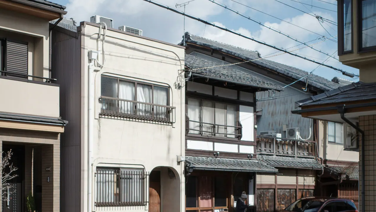
Show real homes, real streets, and real people. Keep the light natural. Let age, repair, and daily life remain visible.
Show the street, neighbours, weather, and distance. Context helps a person understand how daily life may feel.
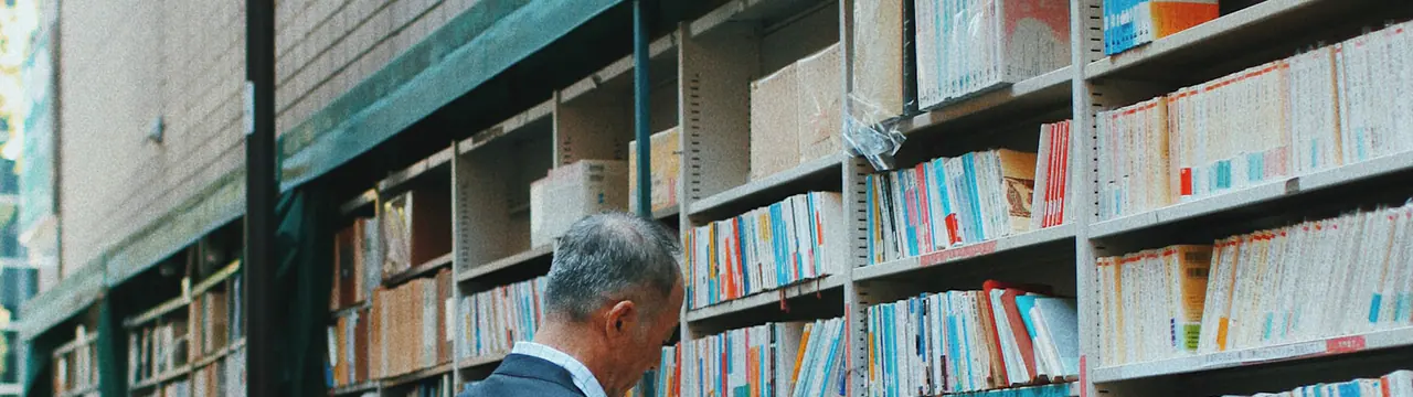
People do not need to perform for the camera. Small actions and natural light often say more than a staged scene.
We guide people through unfamiliar choices. The writing should leave them more informed and more confident than it found them.
Explain the process, name the people involved, and say what happens next.
Write with warmth, but never use warmth to hide a difficult fact.
Treat Japanese homes and communities as living places, not as scenery or bargains.
Feeling comes from honesty and attention. It does not need hype.
Some homes need major repair.
Unlock a hidden gem.
Here is what happens next.
Your dream home is waiting.
Our team contacts the agent for you.
We make everything effortless.
For press and partners
You are welcome to use these files when you refer to AkiyaHub. Keep the artwork unchanged and do not imply an endorsement or partnership.